A Branding journey through a cultural district
Branding + Website Design
Art Directors Club Graphex 51 Winner
THE MISSION:
Create a new visual identity and website for the Asian District Cultural Association.
THE OUTCOME:
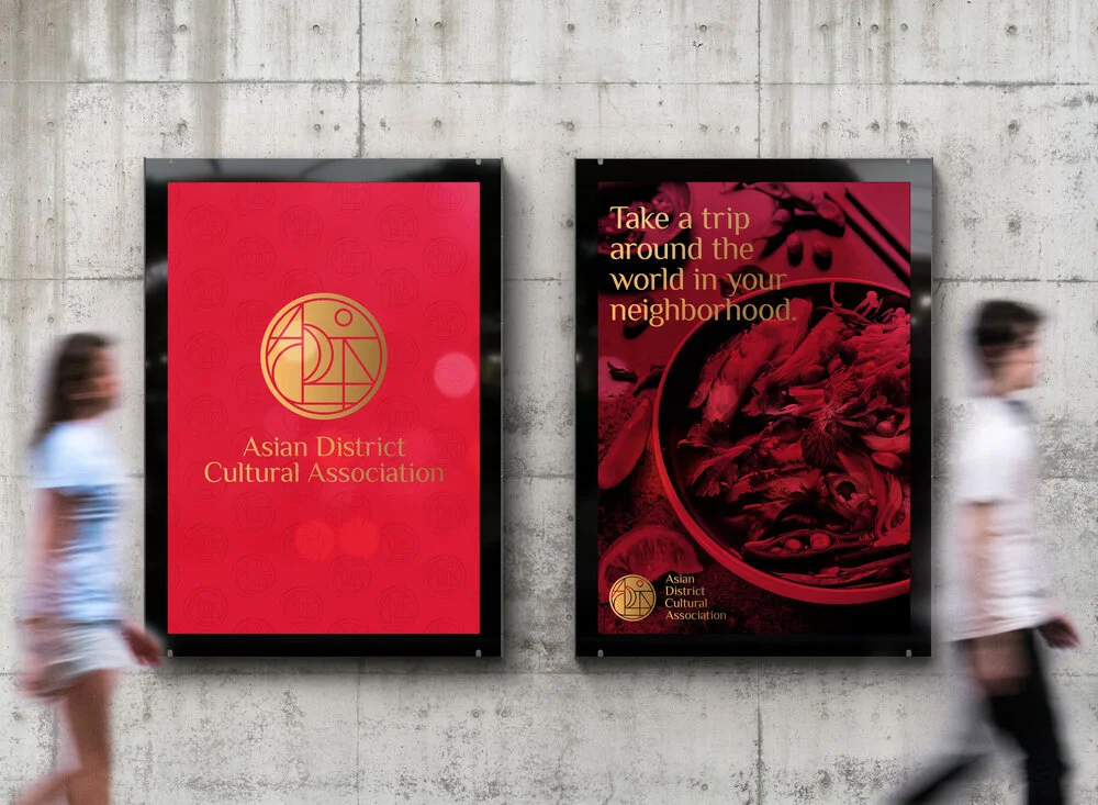
A modern logo blending the various generations of Asians and honoring the richness of the multiple Asian countries this district welcomes, while still developing a visual brand that is approachable to the surrounding community.


WHO
The Asian District Cultural Association is a non-profit 501 C organization looking to promote and preserve the cultural richness of the Asian District in Oklahoma City all while showcasing traditions and building a strong community within the district as well with its surrounding neighbors.
IMPACT
The Asian District approached Nuevo Studio for a full branding project that eventually led to website development and marketing collateral to help promote the district as a whole as well as their events. Over the past two-years we have been working together to create a cohesive system that has been able to grow with the district as they have continued to expand.
THE PROBLEM + SOLUTION
When starting the branding process for a district we encountered various challenges. The main challenges were that it needed to be different than the other visual language that the previous board had been associated with, it needed to encompass traditions, it needed to encompass all of the 48 Asian countries and not focus on solely one; as this logo needed to represent all the nationalities, traditions, and cultural flairs of each without disrespecting another country.
Our first step was to decipher what made this non-profit different and what was the driving force behind their tenacity to rebuild the district. As we peeled back the layers we saw this cultural divide not only between other neighboring districts and the asian district but even within itself. Knowing that the Asian District Cultural Association was looking to promote their cultures and traditions to the whole community as well as to entice the younger generation of Asian Americans to join and be part of the board and understand more about their traditions and cultures we knew we needed to create something that brought things together while still paying homage to the voyage and courage from the first Asian immigrants.
After researching various countries and traditions we landed on a few commonalities, the colors of good luck and fortune, and we went back to the mission of the Asian District Cultural Association and what their desires with this logo were. A mark to encompass old and new, a brand to be approachable by others not from shared heritages.
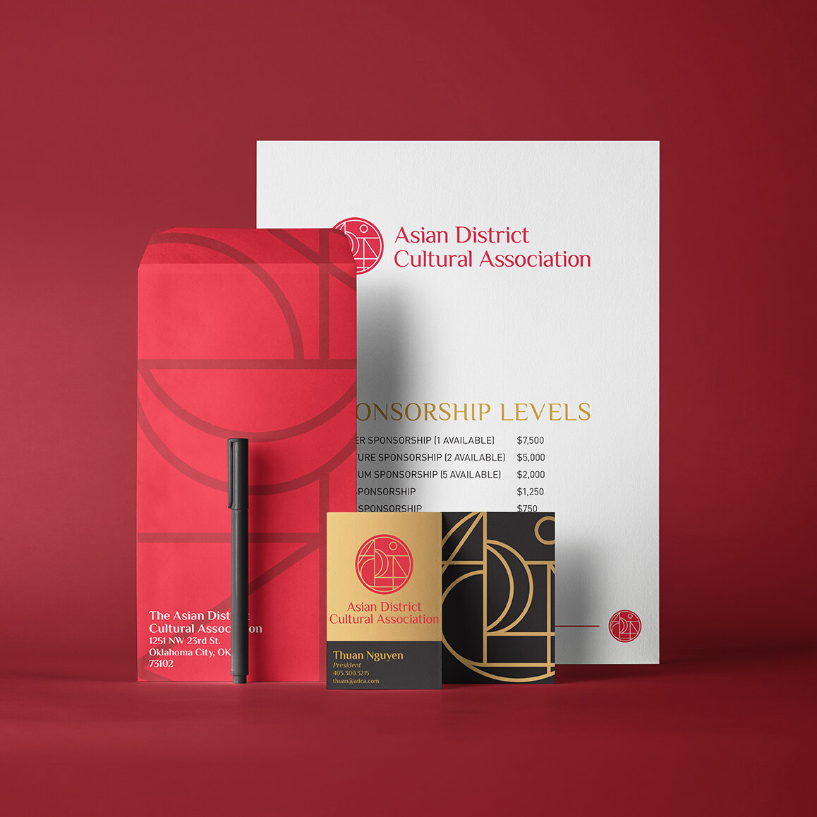
The mark created for the Asian District Cultural Association showcases the ADCA, initials of the organization. Yet this icon is much more than the initials, it truly represents a bridge. A bridge between the older Asian generations and new one. A bridge from traditions and cultures to how those evolve within the community and influence each other. A bridge between their community and culture to the OKC community and culture.
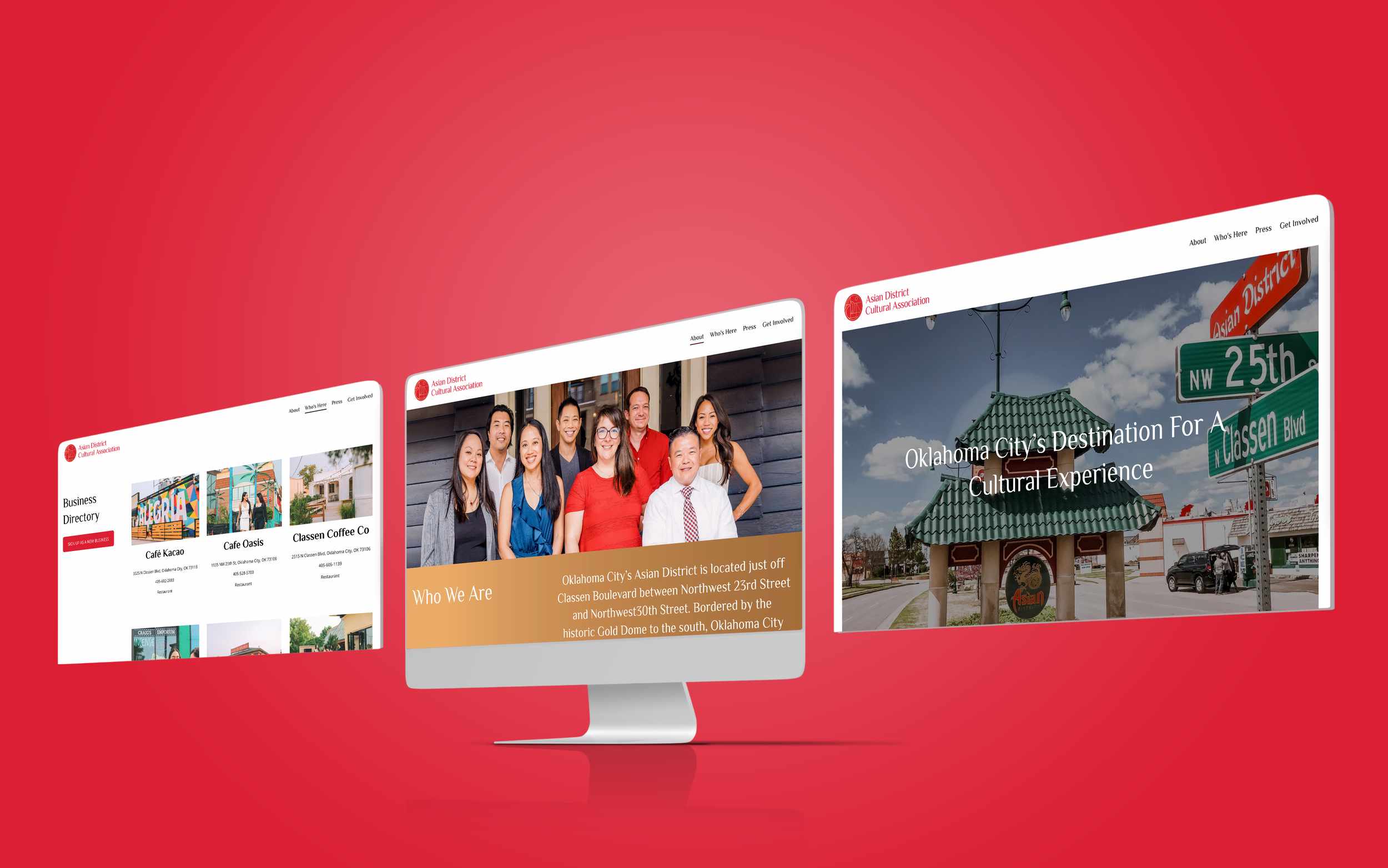
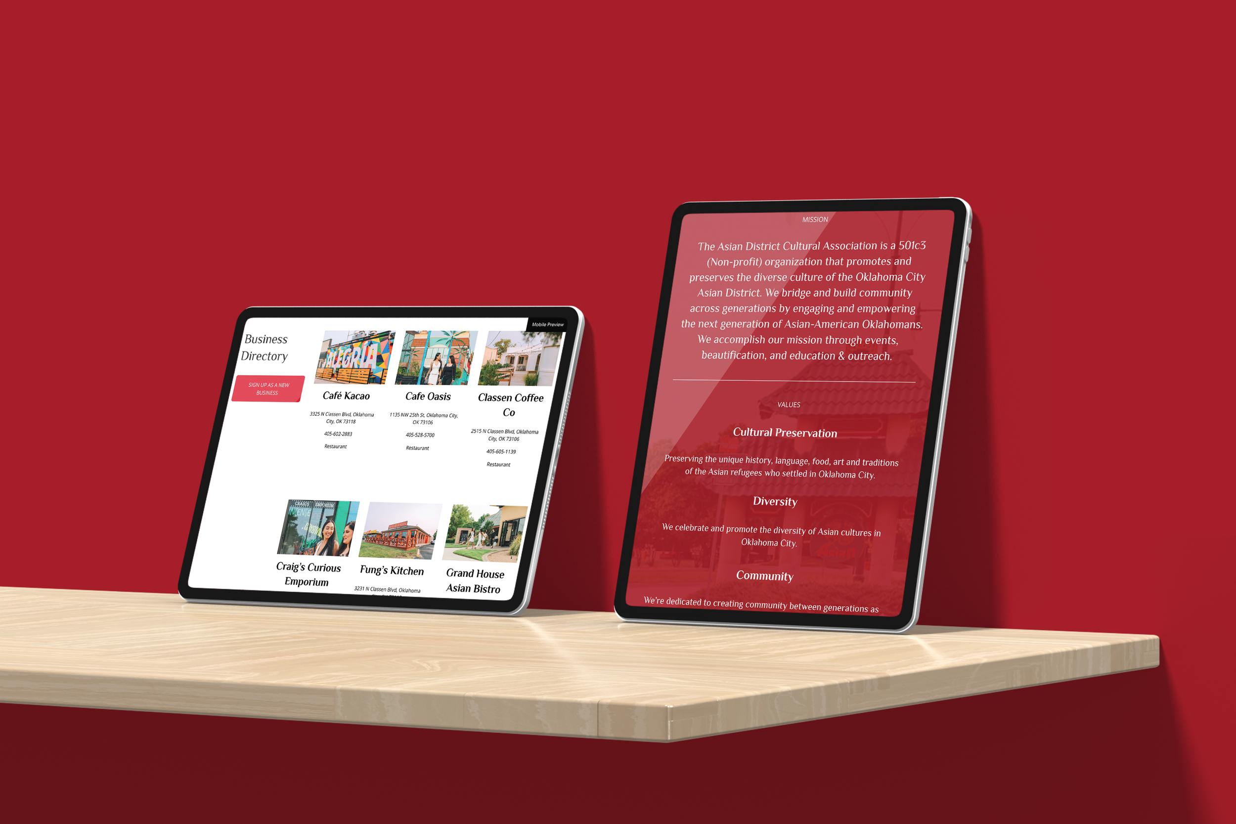
The second problem we encountered was their website was outdated and only showcased their main festival, Asian Night Market Festival. We expanded their website to host a Business Directory, links to other Asian American organizations, and ways to sign up to volunteer or be a district sponsor.